Welcome to the fourth edition of my new blog series, “Artists & Innovators,” a series of interviews with campaigners, entrepreneurs, artists, and advocates who are solving problems with passion and innovation.
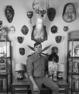
My next interview subject, James Walker, has a background ranging from environments, branding, illustration, to interaction. His work has been featured in several publications and books, and it was part of larger collective projects that are now in the permanent collections of MoMA and the Brooklyn Museum. His work has won several design-focused awards from organizations such as the AIGA and Communication Arts. He received his MFA in Visual Communication and Design from Virginia Commonwealth University. During his studies, he presented his research at conferences globally as well as Richmond’s first TEDx. As an educator, he lectures on design at The University of Texas at Austin.
Husbandmen is the studio practice of James Walker. You can find more include information–including his impressive portfolio–at Husbandmen. Walker did a wonderful job designing the Official John Dos Passos Website. My family, the Dos Passos family, wishes him well in all his artistic endeavors.
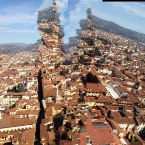
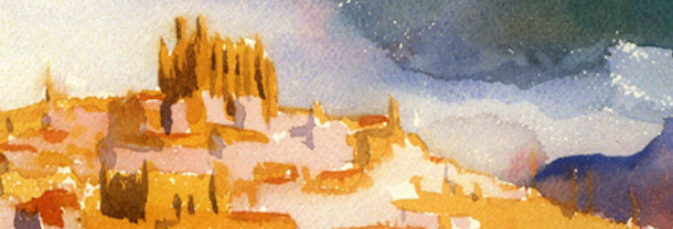
Last year, Walker spent several months in Florence, Italy teaching graphic design. I’ve decorated our interview with several of his shots from the trip.

Our Interview
John Dos Passos Coggin: When did you become interested in the visual arts? Did you always have an inclination toward visual arts?
James Walker: When I was 7, my dad surprised me with a comic book: Teenage Mutant Ninja Turtles #1 from Archie Comics. I loved this comic. It was campy, it featured new stories from a cartoon I was already obsessed with, and it inspired me to start drawing as a means to connect with my dad. I began submitting drawings of my own to Archie Comics and I once received a response signed by the Ninja Turtles themselves. This day was especially memorable because I said the words “Holy Shit” in front of my sister, then immediately pleaded with her not to tattle. I grew up in a trailer park in a small town, and moments like this were all that I had—letters from turtles.
My mother was significant in my future development as an illustrator, converting my bedroom into a work space with shelves, desk, and a stocked set of paper and pencils. I drew comics akin to The Far Side, introducing my humor into the work. I completed a 12-month calendar of comics but I was too shy to distribute it. In secret, my mother printed it, and it remains in a box at her house, never to be seen.
JDPC: Coming of age in the 1990s in America meant exposure to a large amount of commercial iconography, especially on television, newspapers, magazines, and billboards. Did commercial/consumer icons, logos, typography, and branding shape your early, pre-university perception of visual arts?
JW: Most of my exposure to graphic design came in the form of album art, posters acquired at carnivals, and video games. The 90s were strange as technology and style started to swirl around with remnants from the 80s mixing with 90s grunge culture. I think, for the most part, I was confused.
JDPC: Is it accurate to say that your formative years in visual arts were spent in the pre-internet era? How did accessing the internet change your graphic design education?
JW: Not exactly. In the early 90s we had the internet, albeit a crude version. You didn’t visit websites; instead, you visited message boards that led you to more message boards. I remember my sister chatting online with a friend across town who had the handle “SpasticChicken.” His responses were always jumbled characters. It felt magical.
I started school and my parents added a 56k phone line to our house so I could always be connected. At this point, the internet wasn’t a source of information, but a source of media. It was the Napster era. Video games and music consistently streaming in.
My education in design had little-to-no reference to this massive change in the way in which we communicate, but the internet was present. I went to school at the best time; I Iearned analog and digital film systems and I learned to draw letterforms and create them digitally. Best of both worlds with this exciting unknown on the horizon.
JDPC: Generally, is there a difference between graphic artists who experienced the “analog era” and those who know only the “digital era”?
JW: From an experience standpoint, I haven’t noticed much of a difference other than the comfort level of working in a digital space. They are still taught and influenced in a similar way. They just make different things using new media.
JDPC: As a graphic designer, you’ve developed musical album covers for bands. In music history, what are some the album covers that stand out to you as enduring icons? Why were they so successful?
JW: It’s hard not to mention designers such as Storm Thorgerson’s Pink Floyd cover or Peter Saville’s famous New Order cover. The iconography of those records have become independent of the music itself. When I first started buying album art, it wasn’t mainstream music, but underground metal records. Amateur designers were creating the album art through whatever means available to them, giving these records a noticeable grit. Looks at records designed by Aaron Turner or Jacob Bannon, or posters by Derek Hess. That is what I was responding to early on. They felt honest and reflected the music really well.
JDPC: In the era of iTunes, Pandora, and Spotify, what is the significance of album covers? How can they still influence?
JW: At the moment, they are treated as a placeholder. A graphic to represent the album you’re choosing. A quick way to identity. A physical album is held and stared at while the music is being played, allowing the listening to connect the two. That is absent these days, which is sad. We listen to music while we walk, drive, do chores. The relationship between art and music is alive and perhaps they will find a new media to showcase that relationship.
JDPC: You have delivered many lectures on graphic design over the years. What are the lessons that consistently challenge students the most?
JW: First is fear. They are scared to put themselves out there, to move away from their comfort zone, to risk it all and fail. The only reason I know anything is because I constantly make errors and learn from them or put myself in situations where I must learn to succeed.
Second is work ethic. I was a lazy designer for many years and my work showed for it. Dedication to design as a lifestyle absolutely improves your ability to respond well.
Third is mystery. They want to know how things were made, from a technical standpoint, but fail to ask questions about how you got to that idea. Ideation is not the work of a magician and knowing the technical processes doesn’t equate to unique responses.
JDPC: You spent four months teaching in Florence, Italy. What did you enjoy most about the city? What foods did you enjoy sampling?

JW: I spent about 50% of my time in Florence walking. I walked home from the airport and spent entire weekends wandering listening to the sounds of a city. You discover lots of new places and interact with new people as you travel about at such a slow speed. I miss the pace of Florence and Italy in general. Everyone is in a hurry here.
I ate anything and everything. Pecci and Parpadelle noodles with various pestos and ragu sauces. Gelato with spices, pistachio, or fruit. Pizza or coffee everywhere and anywhere. A waiter scolded me for not dipping biscotti into Vin Santo long enough, only to realize that leaving it in for a full minute makes it perfect.
I frequented two places multiple times a week. At Gusta Osteria in Santo Spirito, I ordered a meatball dish with potatoes and a full bottle of wine. At Sandwichic off of San Gallo, the young dudes in bow ties were true sandwich artists.

JDPC: What artistic lessons did you take away from your time in Florence?
JW: That I should slow down.
JDPC: How does color inform your graphic design choices? Over the years, are there certain colors that you’ve come fond of?
JW: I have a palette that I prefer, just like I have typefaces I prefer. When dealing with a client or a musician, there is a color that comes to mind after listening and researching. It’s an informed decision. The relationship between color and type creates a voice for the viewer, so you must choose wisely. I don’t follow color trends. I would rather choose from the same 15 colors for each project, but that never happens.
JDPC: Perhaps there are colors that serve particular artistic or commercial functions time and again.
JW: If we’re talking about album art, what color would you choose for a metal album? Pastels or black? Same for a classical record. You can evoke a tone of seriousness or evil depending on the thing you’re representing. Red is a fast sports car or a sexy lady. Neon green says something else. Mixtures of colors along with the shapes that contain them put you in certain geographic locations.
JDPC: When creating a logo or other design, do you draw something free-hand initially, on paper? How much of your designing happens on paper versus digital?
JW: The reason sketching is helpful for me is because it turns my brain off and allows me to focus on a single task. This doesn’t work for everyone. The relationship between letterforms, how it reads, what symbols immediately relate. Much of this is happenstance. An issue I see with my students and their sketches is that they stop as soon as they think the idea they’ve drawn is correct. For me, the best idea is sometimes there in the first attempt, but other times it appears 50 sketches later. There is a need for pause in this process. Let those sketches sit a minute.
I prefer to have the idea down before I go digital. Once on the computer, I can prototype rapidly to tighten up my illustrations. I might draw 100 icons or 10, but once I have it I immediately transfer to digital.
JDPC: Beyond graphic design, what other artistic interests do you have?
JW: I’ve played guitar in bands for years but most artistic endeavors revolve around a graphic application.
JDPC: What achievements are your proudest of at Husbandmen? What are your goals for Husbandmen this year?
JW: The fact that I’m doing it. It’s a scary thing to go out on your own and make a living and the fact that I’m in my 3rd year, going strong, and making work is really exciting. The studio has won bunches of awards and accolades. They’re great, but they’re a byproduct of sweat and stress.
A goal is making time for personal work, which is often pushed aside for client needs. The original intent of Husbandmen was to collaborate with designers I admire, and often that falls to the side as client needs grow.


